Ski Partner
Role: UX Designer
Brief
Ski Partner was a case study for a new app that matches ski instructors and people who want to have private skiing lessons in Sweden. The product was to function like AirBnb but for skiers and students.
Process
I analyzed the problems, did user research and interviews, looked at the best practices of the competition, created personas and empathy mapping, did story mappying and design studio excercises with the team, created lo-fi and hi-fi wire frames and did usabilty testing. There were three phases of problem solving to create the first designs of the app: Discover, Create and Validate.
Problems
The app had two main users: the ski instructors and the students. When we did story mapping, we realized how we had to really try to understand both end users. I chose to create a persona based on a student and went through the design process to solve her needs. Other members of the team focused on designing the parts of the site that were specific for the ski instructors. My persona was to book a private lesson for herself, for her two kids, coordinate the time and place to meet the instructor, communicate with the instructor and book the lessons.
Solution
First I created a booking function for my persona with place, date and time. Then I added the ability to add additional bookings so that the user would only have to pay for the whole booking. I added a chat function so that she could communicate with the instructors before booking them.
DISCOVER PHASE
Researching, defining and prioritizing the requirements of the project.
The initial brief
We were given an initial brief of the project which identified various hypotheses, background for the project, business expectations and marketing suggestions for this ski matching site.
Here is a pdf of the initial brief we received.

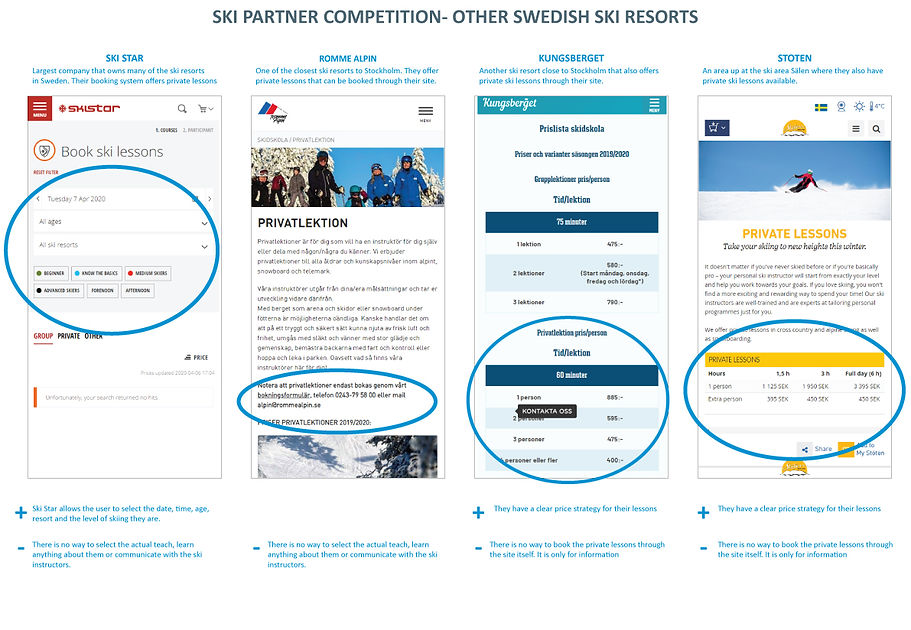
Researching the competition
As this was a new concept, there was nothing similar at all on the market. I looked at the main ski resorts in Sweden and abroad to see how they offered private ski lessons. I did a comparison of what they offered to see if there was anything they did that could be useful for our product.
Creating personas
There were two user types: ski instructors and students. Each member of the team worked on researching and creating a persona that would be a key user. As the largest customer group we were considering were families with kids, I chose to create Malin.
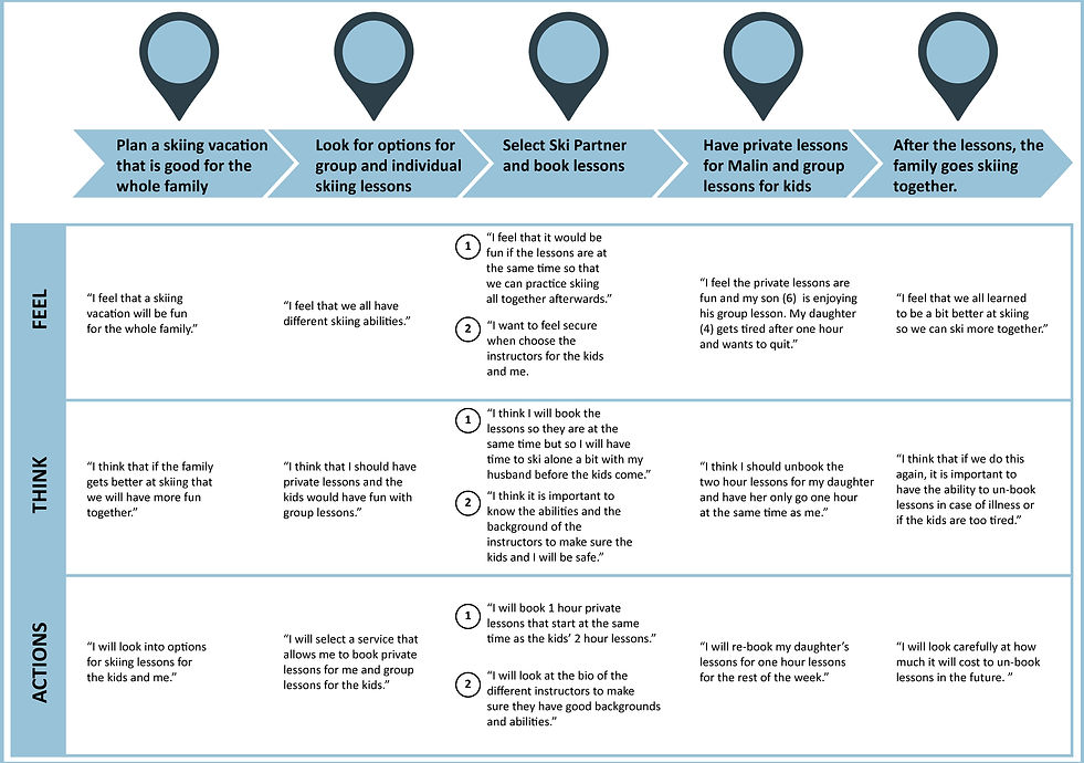
Malin is a married mother of two who enjoys skiing with her family. She is planning to go to Vemdalen week 9 for spring break and would like to book private lessons for herself and her two kids. She would like to find two instructors and coordinate the schedules to ski simultaneously.

Empathy mapping
Then I created an empathy map for Malin to help identify her thoughts and actions as she tried to accomplish her goal of booking herself and her kids with private lessons.
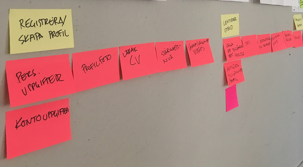
User story mapping
The team got together and had an excercise in user story mapping based on our personas and empathy mapping to help figure out functionality needs of the app. We mapped out major and minor tasks needed to achieve each each goal.
Design studio
Next we did a collaborative excersise called Design Studio where we came up with design solutions. We had to quickly sketch up how our personas would go through the major and minor tasks we had determined. We had 5 minutes to sketch for each task and then we each presented our solutions to the others. Team members could give feedback. Then we re-sketched and included some of the solutions that other team members had created. We repeated the excercise after the second set of sketches, we agreed on which elements best solved particular design needs.


Identifying product requirements
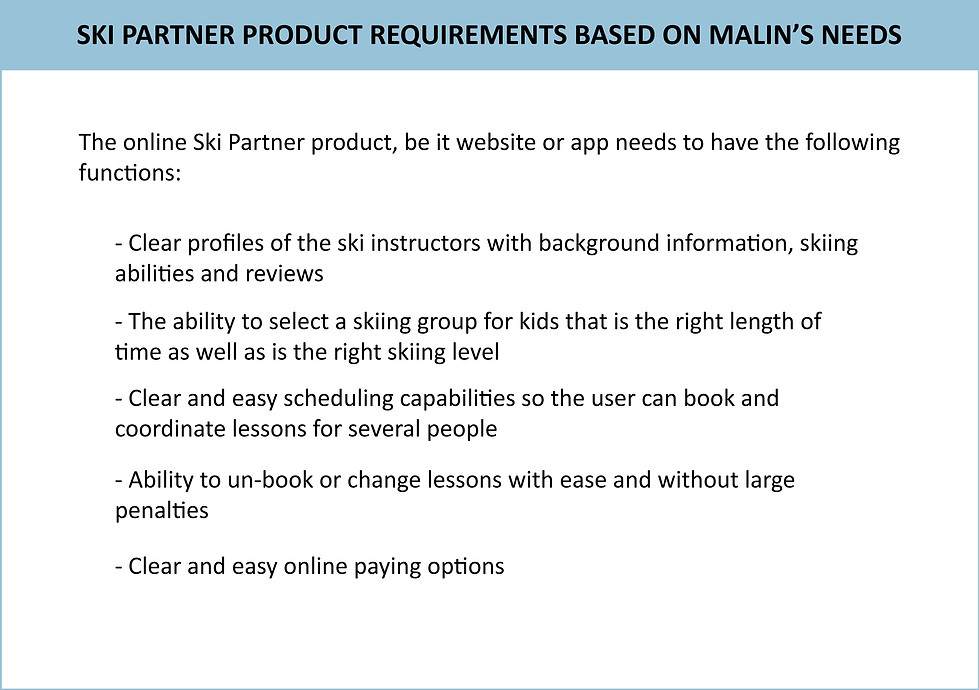
After story mapping, we returned to identifying which product requirements were essential for each persona.
CREATE PHASE
Ideating, interations, paper and digital wire frames
Functions selected to design
The next step was to identify some solutions to some of the challenges that Malin would face. While there are so many different aspects of the product that needed to be designed, I chose to focus on the following four:
-
Step 1-The sign-up
-
Step 2-Create a user profile
-
Step 3-Book lessons for herself and her kids
-
Step 4-Communicate and confirm booking
LoFi Paper wire frames
For each of the four steps I worked on, I did multiple iterations in paper form. Here is how the first drafts turned out.
Designing the Sign Up part of the app was the easiest part of the design. Since users of the app can both be students and teachers, the first sign in landing page allows for the user to choose one or the other. Since Malin is a student the design was based on how a student who has never used the app would sign up for it.
Step 1-The sign-up

The next step was for Malin to create a user profile. This was more complicated and there were many more things to consider. For example, was it important that the student spend so much time creating a user profile is she just wants to quickly book lessons? These things had to be addressed.
Step 2-Create a user profile

This was the most challenging user flow to design. First, there had to be a way for choosing the location, date and time for each lesson. It was hard to figure out how that could be done and keep the design simple. Also, since Malin was going to book private lessons for herself and then coordinate them with private lesson for her kids, it made it more complicated. If it was only a one to one booking, it would be simpler. I did quite a few iteractons on how to do that settling on one that included each individual skier, a calendar where the user could input dates/times and then have filters for skiing preferences like skiing or snowboarding.
Step 3-Booking lessons for herself and her kids

Step 4-Communicating & confirming a booking
Malin is a careful mother and wants to make sure she knows the qualifications and abilities of the teachers. She also wants to have personal contact with them before booking so she can ask about their experience with kids as well as to coordinate to meet them. Therefor it was important to include a text/ chat function to the design so that Malin could communicate before booking.

To make the next step (testing) easier for the users, I made interactive wire frames in XD based on the lo-fi paper wire frames with a few adjustments.

VALIDATE PHASE
Usability testing and adjusting design flaws
Defining and planning the test
To plan for the test some of the problems & challenges the user could have needed to be identified. Then I worked on creating tasks for the testers, hypotheses and questions for validation.


The qualitative test
The testers were given the test on the computer as an interactive XD file. They performed the three tasks while speaking out loud to explain what they were doing and say if they were not understanding something.

The summary of the testers was as follows:
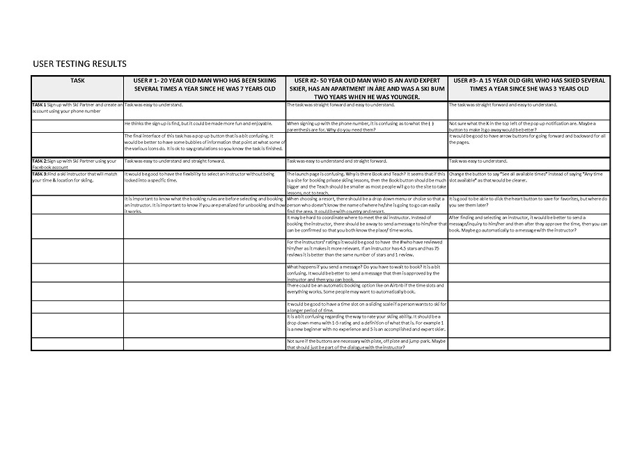
Summary of design changes
From the usability testing, there were some clear things that needed to be changed. Here are details of the changes made to each of the segments represented by the three different tasks the users performed.


Adjusted wire frames after testing
The usability tests gave a lot of insight into some of the improvements. Using some of these and doing multiple iterations, I did more XD basic wireframes to test the functionality of the site. Here is a preview of how the latest iteration before moving on to work on the UI of the design.

Conclusion
As this was a case study for the functionality of a concept, we decided not to go forward with the project and finish the design. It was a good excercise in understanding a site that has two main end users with different needs. Some of the other groups had personas that were ski instructors and developed their products with them in focus. It would have been great to have had the time to incorporate more of the other team members' ideas and complete the project, however our project was put on hold due to the Covid 19 crisis.