Åhléns
Role: UX Designer
Brief
Åhléns is Sweden's only department store chain. They launched their e-commerce site in 2016 and after several years sales were stagnating and there was a need to update the site in order to improve sales. Customers couldn't find items through the drop down menus that were hard to navigate. The part of the project that I focused on was to improve the search, sort and filter functionalities of the mobile version of the site.
Process
I analyzed the problems, did user research and interviews, looked at the best practices of the competition, created personas to then do empathy mapping, created lo-fi and hi-fi wire frames and did usabilty testing. There were three phases of problem solving to identify & make suggestions to improve the design: Discover, Create and Validate.
Problems
The search fields, filtering/sorting and drop down menus were all disfunctional and customers couldn't find the items they were looking for. The drop down menus had too many categories and subcategories making it difficult to find items through that route. Most customers went straight to the search field, but there was no way to filter the results, so customers couldn't find items in either of the ways to find them.
Solution
There were two solutions: 1) to implement auto-fill, sort and filtering after an item was searched for in the search field 2) to simplify and improve the way the drop down menus worked by re-organizing the categories and creating new user interfaces for them.
DISCOVER PHASE
Researching, defining and prioritizing the requirements of the project.
Identifying business assumptions
We had a session to identify and list various assumptions about the e-commerce site. From this list, we determined that our focus was to be.

The hypothesis
Our main goal was to improve the conversion rate. There was a high abandonment after the users started to search for products. One of the requirements was to increase this to the industry standard of 1.85% or at least improve it from the low conversion rate of 0.8%.
We believed that by improving the search, sort and filter functions of the site for our users that we could increase the sales. We believed that we would know this to be true if we increased the conversion rate to be 0.9% or higher.
Quantitative data
We reviewed data collected from the Åhléns customer club and customer surveys to understand who our main customers were.
The largest customer group was a 40-50 year old woman living in an urban setting.

Qualitative research
We also decided to interview 10 key users and gave them tasks of purchasing various products from all different departments and noted their comments. Here are some of the notes from user testing.

Some of the testing notes
Screen filming from user testing the search function of a black men's jacket

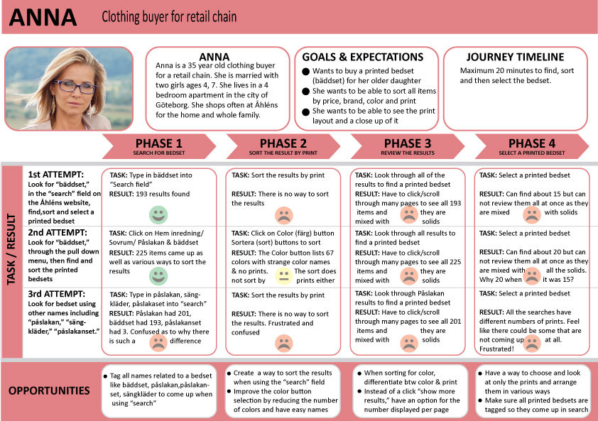
Personas
From the company data we had on our customers we created user personas based on our top categories of customers.


User journey
The personas were given shopping lists based on their needs. We then did simulated shopping through the website to find pain points for finding various items. There were two main ways that the customer searched for the items: often it was first through the search field, but if that did not have a direct hit, then the user would go through the Top Navigation bar and then to the left hand navigation bar. We created user journey mapping to identify the pain points.

Defining and prioritizing requirements
The combined data from all of this research gave us a list of changes we defined. We then discussed and prioritized the necessary changes with the rest of the team.

CREATE PHASE
Competitive analysis, ideating, creating wire frames
Competition analysis
In e-commerce there are many examples of good design that works. It is changing all the time. I chose to look at some of Åhléns top competitors to see what design patterns they use that we could borrow. The competitors that had some of the best were H&M, Zara and Zara Home, Zalando, John Lewis and a website that is unrelated (Systembolaget) as it had a design pattern for its app that could be useful. I tracked what a user journey to purchase various products would be like on some of these sites and compared various design elements to find solutions that could be adapted for our product.


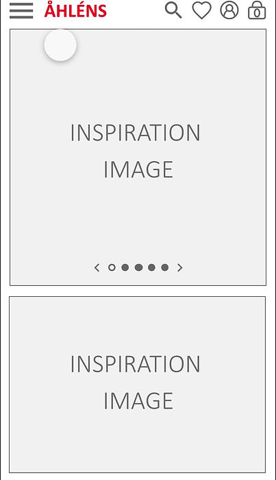
Lo-fi paper wire frames
I did many iterative lo-fi paper wire frames to try to work out the designs for the mobile version of the site.

Interactive wire frames
After discussing various design solutions with the team, I created many iterations of basic wire frames to test the functionality of the site.
VALIDATE PHASE
Usability testing and adjusting design flaws
Åhléns
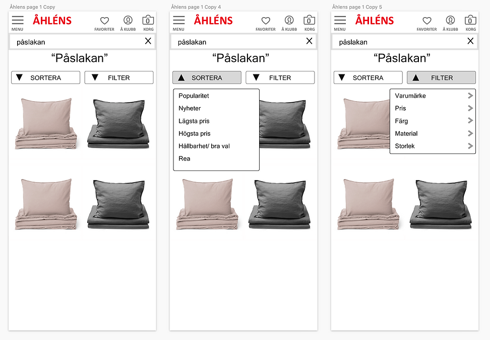
Interactive wire frames
I made some interactive wireframes to test the design solution for just one type of product: a printed bedset. We had identified that it was particulary difficult for customers to find products from their private label collection, especially due to disfunctionality of sorting/filtering colors and prints. By choosing a printed bedset, we could see if the customer would be able to find what she/he needed through various ways of searching: through the search field, the hamburger menu and a button on the landing page. Here is the interative wire frame and how it could be navigated.

Qualitative Usability testing
We had several testers test the functionality of the search field and hamburger menu. This could be done wtih XDs sharing function so that it worked like the mobile version or app itself.

Here is a summary of the two main tasks we tested and some of the results of these qualitative tests. They gave insight into some basic design changes that we could implement before designing more of the pages of the site.


Summary of design changes
From the usability testing we made some simple design changes before we began to design all the rest of the pages of the site. We were happy to see that the users had no difficulty in navigating either the hamburger menu or in using the search field and then filtering. The minor changes of the hamburger menu and the filter /color page were easier than if the entire layout had been difficult for the users to navigate.
